At Bodegas Mamerto de la Vara, we are celebrating our 85th anniversary this year. Since it was founded in 1940, our family tradition and dedication to quality craftsmanship have been the cornerstone for making sweet wines that reflect the essence and legacy of our history.
On the occasion of this special anniversary, we have carried out a strategic renewal of the label design in three of our main ranges: vermouth, muscat and mistela. This visual update responds to the need to strengthen the identity of our winery specialising in the production of sweet wine, adapting the image to current aesthetic criteria that enhance its presence in the market.
VERMOUTH: COMPLETE REDESIGN IN PET FORMAT
In the vermouth range, we have completely redesigned the labels for the 2 and 5-litre PET bottles, corresponding to our red vermouths “Fórmula Antigua” and “Calidad Artesana”. This change represents a commitment to a vintage-inspired design, which pays tribute to our history and the artisanal character that defines our vermouths.
In addition to updating the aesthetics, we have improved the structure of the information to facilitate its legibility and quick identification by the consumer, thus reinforcing both the brand image and the commercial functionality.
MUSCAT: RESTYLING RESPECTFUL OF THE ORIGINAL IDENTITY
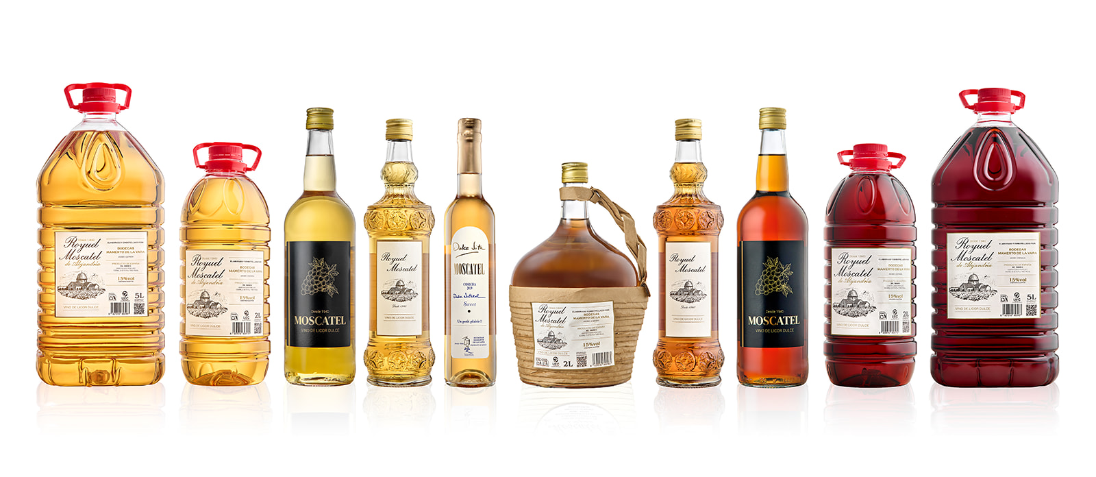
In the Muscat range, we have opted for a subtle restyling that maintains the original essence of the designs, but with adjustments that update their aesthetics and harmonise them with the company’s overall image. Specifically, these changes help to reinforce the brand’s graphic coherence and improve integration with the rest of our sweet wines. The redesign covers the labels of the Muscats in 1-litre bottle format, as well as the entire Moscatel Royuel range.
MISTELA: VISUAL EVOLUTION WITHOUT RUPTURE
The renewal of the labels in the mistela range follows the same line as the muscats, including all the available formats of Mistela Royuel. The new design maintains a faithful aesthetic to the previous version, with an update of visual and typographic elements that provides greater coherence, without losing the traditional character that defines this product.
In addition… The appearance of our “Corinto Blanco Dulce” vermouth has also changed.
With the renewal of labels, we have also updated the presentation of our Corinto Blanco Dulce vermouth. It now has a white cap, a different look but with the same flavour as always.
A renewed design that reflects its fresh, sweet and elegant character. Although its image has been updated, it maintains the original formula that has been with us since 1940. Because the essential is still the quality and authenticity that define our vermouths.
AN INAGE THAT EVOLVES, AN ESSENCE THAT REMAINS
This image renewal process is part of a broader strategy, driven by our 85 years of experience in the sweet wine sector. The main objective is to give our vermouths, muscatels and mistelas an updated image, while reflecting the family tradition and artisanal quality that distinguish us.
All the information about the new labels is on our website https://mamertodelavara.com/nuestros-vinos/